What are The Famous Football logos in 2022
MLS which stands for Major League Soccer was founded on 17 December 1993 by Lamar Hunt and Philip Anschutz. Almost 27 teams are under MLS of which 24 are in America and remaining in Canada.it is said that by 2023 it will be expanded to 30 teams, figures crossed.
But currently, we are talking about the logos of each team. As every logo is uniquely different from others and has some stories behind it. As every logo have a different and impressive identity, so we are discussing the top 15 logos according to their creativity.
As we know that while establishing a brand we have to keep on focal point on logos also, it will be the first things which customers notices. So it should be classy yet decent which can easily grab the audience’s attention. As it will allow your brand to prosper and grow, which will help you to represent it in a local community on a good scale and later on an international level.
Following are the top 10 logos of MLS teams, when you are done with reading these 10 logos you will be ready to establish your team on a good scale with great tactics and strategies or you can at least get prepared to apply for the quiz of MLS logo and achieve a great score.
MLS logo of 2021:
Houston Dynamo:

Houston Dynamo or we can also call it orange crush because of its logo. As we can see it have an initial of names’, so it’s a monogram. The team was launched in 2005. The crest in the logo is inspired by many football logos.
Real salt lake:

This logo has all the initial of the team name in a very unique and quite interesting way, which easily can grab the attention of the audiences as this logo contain all basic colors. It team was also founded in 2005. This American club is under Dell Loy Hansen.
New England Revolution:

The attentiveness of this logo is that it has no initial of any word on this logo still it has easily become a focal point for the audience, as it is similar to the American flag. The only difference is that it has a ball of soccer instead of stars. This club is own by the very famous The Kraft Group, this club is also very popular as Revs.
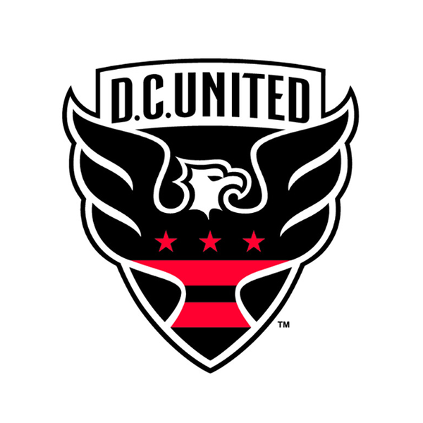
D.C united:

This logo is redesigned by the shield logo to get more audience’s attention. Although both logos have a minor design in the face of an eagle. D.C united is mange by the Eastern Conference. It is said that this represented the family crest of George Washington.
New York FC:

These types of logos are known as monograms because they have initial of the name. This soccer team was founded in 2013 and it is also a member of the Eastern Conference. As we can see that this logo has all the shades of blue even in the middle of the logo it has a dark blue shade on which the initial is embossed.
Inter Miami CF:

Inter Miami CF is also known as The Herons, it is founded by very famous footballer David Beckham in 2018. The logo has two pink and white flamingo birds, who are standing back to back with one leg raised. This logo contains three beautiful colors white, black and pink, which make the logo vivid splash.
Minnesota United Fc:

Its logo is quite creative and meaningful. There is a loon on the logo with some spectacular color combinations of black, blue, and grey. Which makes the logo more interesting. This club was launched in 2017 and become the 22nd club of MLS. This club is owned by Bill McGuire.
Sporting Kansas City:

Sporting Kansas City or we can call Sporting KC. Its shield logo is a monogram, have all initials of the name. It is an American soccer club based in Kansas City, which was founded in 1995. The logo contains a beautiful fusion of royal blue and grey.
Chicago Fire FC:

Chicago Fire FC is serving since 2002 under Eastern conferences. The logo of the Chicago Fire FC had been redesigned in 2020, whereas the logo has a compound of yellow and orange color which is a representation of the fire and the crown.
FC Dallas:

FC Dallas is founded by Clark Hunt and Dan Hunt in 19996. Its logo has an aggressive bull with a color contrast of blue and red which makes the logo more esthetic and then the old color combination.
Conclusion:
Above we have mentioned the top 15 logos of MLS, with their background stories, and have described color combinations in detail. Through this, you can easily get ideas that, how you can get the audience’s attention just by playing color with creativity.
Most Popular Reads
- Design Thinking: How Does Empathy Impact Your Design?
- Understanding for the Need of Logo with Fixed Solutions
- The Future of Logo Design for 2022
- Creating a Foolproof Marketing Strategy for Your Business
- 10 Famous Cryptocurrency Logo Designs
- Enjoy the Hassle-Free Downloading Of the 7 Best Logo Makers
- 9 Famous Yoga Brands for Yoga Logo design Inspirations
- Top 10 Fonts for Logo Designing in 2021
- 5 Steps to make Good icon design
- 10 Famous Jewelry Brands in UAE